

How We Elevated NextMovez Website!
When NextMovez partnered with us, their website was attracting healthy traffic but converting only a fraction of it into bookings. As the Best Digital Marketing Agency in Bangalore, we saw this as a design opportunity rather than a marketing problem.
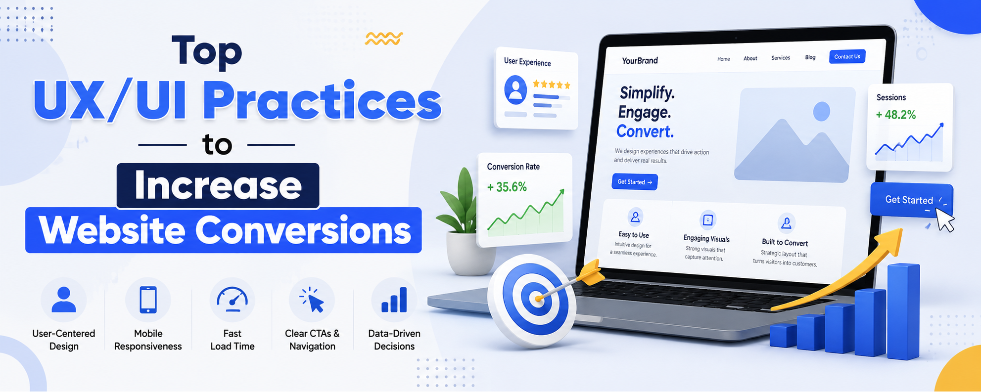
By applying proven UX/UI Practices to Increase Website Conversions, our team at AimGlobal Digital helped transform their site into a smoother, more persuasive experience. Here's how.
1. Clarity Over Cleverness:
We rewrote the homepage headline so visitors instantly understood the value on offer — clear, benefit-driven language, with one focused message per page.
2. Strong, Focused CTAs:
Every screen now carries a single, high-contrast CTA with action-oriented copy like "Book Your Move Now," placed above the fold once value is established.
3. Visual Hierarchy That Guides the Eye:
Using size, spacing, and an F-pattern layout, we directed attention naturally toward booking points, grouping related elements for a cleaner flow.
4. Reduced Friction:
The booking form went from 12 fields to 5. We added Google sign-in, progress indicators, and inline validation to keep the journey smooth and simple.
5. Stronger Trust Signals:
Genuine testimonials, recognizable partner logos, security badges near payment, and a clearly visible cancellation policy now reassure visitors at every step.
6. Speed & Performance:
Optimized images and lazy loading brought page load time down from over 5 seconds to under 2.5 — a change that visibly improved engagement.
7. Mobile-First Design:
We rebuilt the mobile experience with larger tap targets, a sticky "Get Quote" button, and thorough testing across real devices.
8. Leveraging White Space:
Extra breathing room around CTAs made the next step feel effortless and intentional, especially on premium service pages.
9. Simplified Choices:
Seven service packages were streamlined into three clear tiers, with additional options revealed only when relevant.
10. Social Proof at Decision Points:
Testimonials and star ratings now appear right beside the CTA, alongside real-time activity like "12 bookings made today."
11. Consistent UI Patterns:
Navigation, colors, and interactive elements were standardized throughout, so every page feels familiar and easy to navigate.
12. Continuous A/B Testing:
We continue testing headlines, CTA colors, and hero imagery, letting real data guide ongoing improvements.
The Result:
Applied together as a complete system, these changes led to a meaningful increase in bookings for NextMovez within weeks — a clear example of how thoughtful UX/UI Practices to Increase Website Conversions deliver real business outcomes. What stood out most was how these improvements compounded: faster load times supported better engagement, which in turn made the simplified CTAs and trust signals even more effective. This is the value of treating UX as an integrated system rather than a checklist of isolated fixes — each element reinforces the next, and the impact on conversions becomes far greater than the sum of its parts.
Let's Do the Same for Your Website.
We believe the best way to start a conversation is by showing value first. Share your website URL with us, and our team at AimGlobal Digital will review it and share three specific UX improvements we'd recommend — genuinely useful, with no obligation attached.
If those recommendations resonate, we'd be glad to help you build out the rest, just as we did for NextMovez. Either way, you'll walk away with practical insights you can use.
Get your free UX review: https://aimglobal.digital/
A website that converts well doesn't just look good — it works harder for your business, every single day.